
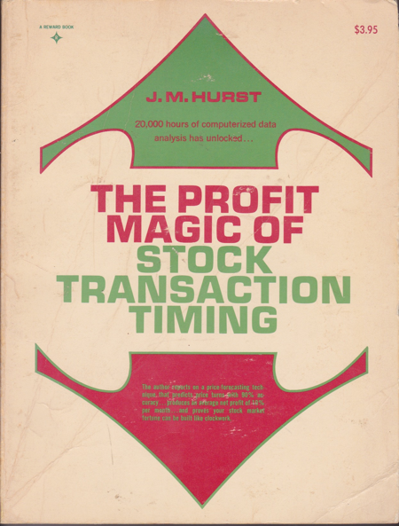
 Stephen Elliott Briese began his trading career in 1969, a time before the era of PCs and trading software. He became interested in the application of cycles to futures prices after picking up J.M. Hurst's 1970 classic, "The Profit Magic of Stock Transaction Timing." The $3.95 first edition remains a cornerstone of his trading library (though it took him 40 years to discover how to apply it).
Steve took membership in The Foundation for the Study of Cycles (during its first iteration under founder Edward R. Dewey) and purchased the 4-volume leather-bound limited edition "Cycles Classic Library Collection." When PCs came along, he went beyond the software available at the time. Steve had custom statistical software built for cycle analysis, which he reported in his original Market Revolutions newsletter, beginning in 1999.
Doing his own research, Steve found cycles endlessly captivating, but frustratingly difficult to apply in real-life market timing, what with trend-dependent cycle translation, unpredictable cycle inversions, assorted nesting harmonic and discordant cycles hugely impacting dominant cycle phase and amplitude. Over time, he came to appreciate the words of a friend and fellow newsletter editor, now departed, Richard Russell of "Dow Theory Letters" who was fond of saying, "I just love cycles, but where are they when you need them?"
The problem in using statistically derived cycle projections to time asset buying and selling is that finding tradable cycles is hit or miss, requiring other technical analysis tools to confirm anticipated cycle turns, usually with a significant lag time. After many years of writing Market Revolutions, Steve shelved the newsletter in 2006. He continued to incorporate cycle analysis into his trading and adjunct to his other market advisory services.
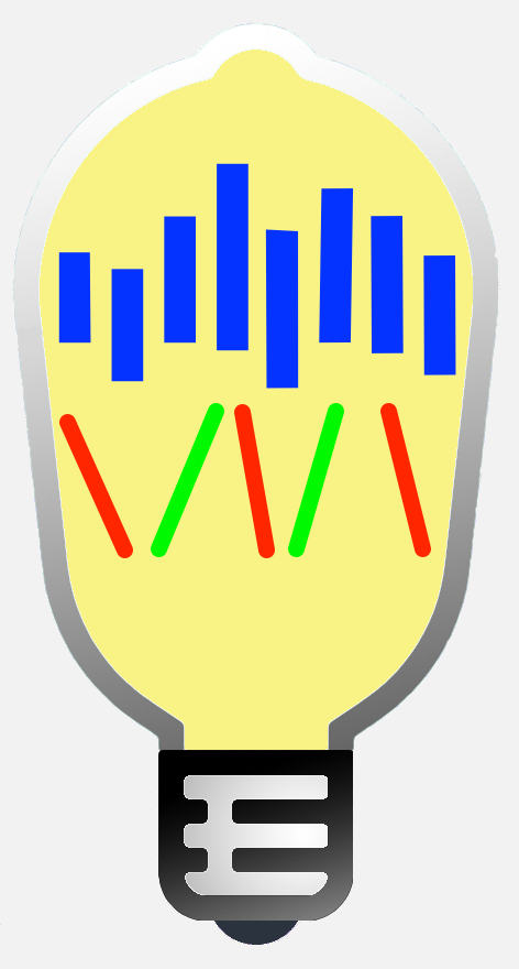
Then, in 2013, the 44th year of his trading career, Steve had a lightbulb moment: What if you introduced disruption cycles to isolate synchronous cycle troughs from cycle peaks? Little did he know that this inspiration would result in an algorithm that went beyond forecasting cycles, instead, actually recognizing cycle turns in real-time, resulting in a seminal advance in the application of market cycles to trading and investing cycles when you need them. Briese Disruption Cycles™ identified a specific set of unifying harmonic market cycles present in every asset class, unit of time, and, remarkably, both up and down cycle phases. And wouldn't you know, these cycles turned out to be a subset of Hurst cycles. He spent the next seven years developing this discovery into what you see today in Market Revolutions.
Steve's appearances over the years:

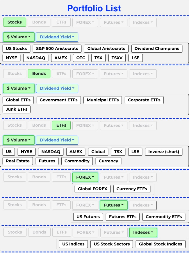
Portfolios
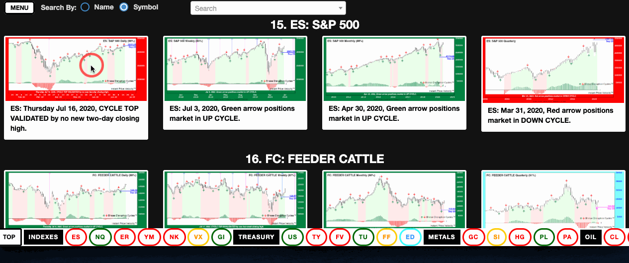
Market Revolutions identifies cycle turns in more than 50 portfolios using multiple harmonic cycles.
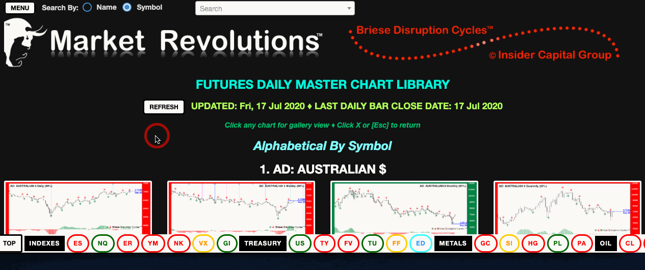
IMPORTANT: Price charts are updated daily, so the last weekly, monthly, and quarterly bar will be incomplete until each respective end-of-period. This bar closing date is noted on the respective chart portfolio page heading. Signal failure warnings for all intervals are updated daily, but new cycle turn arrows are not available until weekly, monthly, or quarterly bars are complete. If the UPDATED date is not the prior trading day, press the [REFRESH] button.
If the UPDATED date is not the prior trading day, press the [REFRESH] button:

NOTE: Cycle turns are actionable on the open of the bar immediately following the turn signal with 88% average reliability∗.
RANKING: Several ranking types are used dependent on the equity and data available. The ranking method is shown above the first row of charts on each portfolio page, as follows:
- Alphabetical: Futures, FOREX, and Index portfolios are displayed in name order. The bottom navigation bar order varies. Futures are shown by sector; FOREX are listed by the base (quote) currency—second symbol in name; Indexes are in alphabetical order by symbol.
-
The bottom nav bar is in symbol order for the following rankings:
- Top 50 Issues Ranked By $Volume: 3-month average trading volume, ranked highest to lowest. These are the most popular securities over time.
- 50 Most-Active Issues Ranked By $Volume: Securities are first ranked by 3-month average trading volume. This list of most popular securities is then re-ranked by 1-month average divided by 3-month average volume; in other words, the most popular Top Issues of the past month.
- Top 50 Issues Ranked By Dividend Yield: These securities are ranked by their average yield over the past 12 months.
There are, at this writing, 52 portfolios representing a broad range of asset types and ranking methods. Sources for both the classification and ranking data are deemed reliable, but accuracy is not guaranteed. We publish over 10,000 charts each trading day. Users are encouraged to report discrepancies. Securities are included based solely on their past dividend yield or trade volume ranking. The inclusion of a security should not be construed as a recommendation of suitability to trade or invest.
Main Menu

Although there are more than 600 portfolio pages to choose from, we have tried to make finding what you want very simple, and your selections will be unchanged when you return to the menu, so you know where you left off. Simply select one button in each of the rows. Alternately, use the Search function to find your symbol and the necessary buttons will be selected for you (defaulting to Master Chart Library View / Daily Cycle)
View: There are 3 ways to view the charts. Try each of them; you will find one that works best for you.
The New Signal and Master Library views show all longer-term charts beside the cycle period you choose (see Cycle, next). The New Signal Scan shows only the charts with new signals in the period you choose. BUT, you can always see all four time periods by clicking on any chart to bring up the gallery view.
Cycle: There are 4 cycles for each security. To see new daily signals, select Daily. The Scan View will display only the time frame you choose, while the Library Views will also include all longer-term charts:
- Daily: daily, weekly, monthly, and quarterly.
- Weekly: weekly, monthly, and quarterly. And so on.
Class: FOREX, Futures, and Indexes will bring up a menu of portfolios available in the respective Class or category. Stocks, Bonds, and ETFs offer an additional choice of Rank By: $ Volume or Dividend Yield.
[CLEAR] button clears all of your current selections, giving you a fresh menu. BUT, changing a selection in any row will maintain your current selections, giving you the requested portfolio list based on your new row combination. In other words, you don’t need to CLEAR the menu to change to a different View, Cycle, or security Class.
Portfolio Page
This portfolio page – displayed by selections made on the main menu – offers multiple methods to find the issue you want.
- Top Search Bar: Search by security Name or Symbol. Your choice will be narrowed as you type. Click on your choice or press 'Enter' button if your choice is highlighted in blue.
- Bottom Navigation Bar: Scroll horizontally using mouse, trackpad, left/right arrow buttons, or fingers if using a touchscreen. Click (or touch) the desired symbol, which are (except for Futures & FOREX) in alphabetical order. Futures is listed by sector, FOREX by base (quote) currency.
- Scroll Vertically using mouse, trackpad, up/down arrow keys, or fingers on a touchscreen.
Full-size charts are available in gallery view by clicking on any chart.
IMPORTANT: These charts are posted by midnight each trading day. Please check the Updated date in yellow at the top of the page and click the [REFRESH] button if the date shown is not current. (Posting will be delayed a couple of hours by our reranking process on the last trading day of each month, at which time you may notice changes in the order and names of securities listed.)
To return to Main Menu, press the 'MENU' button at the left of the top search bar.
Chart Gallery
Clicking any chart will display four time-period charts in the gallery view, allowing you to easily switch periods by clicking chart using:
- Thumbnails
- Previous / Next Navigation arrows
- Keyboard direction arrows
- Scrolling on a touch screen
NOTE: Press the [Esc] button will always return you to the previous view (full screen to normal window, or normal gallery window back to portfolio page. (You may need to press [Esc] more than once to return to portfolio page.)
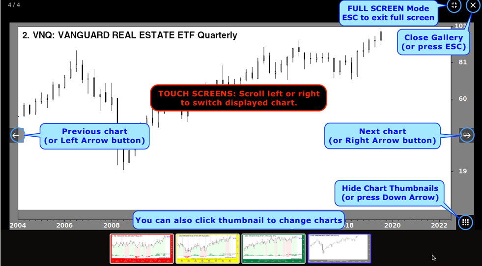
Chart Frame Color Codes
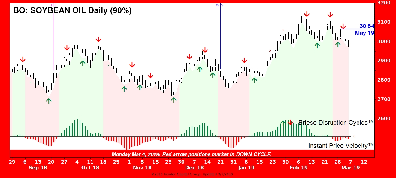
RED FRAME – BEARISH. A red frame can mean one of 3 things:
GREEN FRAME – BULLISH. A green frame may be due to one of 3 patterns:
YELLOW FRAME – CAUTION Potential Signal Failure. Yellow means that the most recent cycle turn arrow is in danger of failing. A daily closing price has penetrated the level of the most recent valid arrow but by less than 5% necessary to label it a signal failure. If the breakout continues to obvious failure, the frame will revert to the color of the previous turn arrow (#2 in the above descriptions). Because weekly, monthly, and quarterly charts are updated daily, a "signal failure" can be reversed before a bar is completed at the respective end of period. Trading is a game of odds, not certainties.
BLUE FRAME – NEW PROVISIONAL SIGNAL. A cycle turn is detected, which is provisional until the next (daily, weekly, monthly, or quarterly) price bar is complete. For a cycle low (shown in magenta), the next bar's closing price cannot be below the low of the current bar nor its preceding bar (no new two-bar low) on a closing basis. If a new low is recorded on the bar's closing price, the chart frame will return to red, reflecting the previous red turn arrow and the provisional magenta arrow will be replaced by a green "X", which serves as a permanent record of a repainted arrow (non-validated turn signal).
For a provisional cycle high down arrow, a new 2-bar closing high will cause a red “X” to be painted. Repainting occurs in about 1 of 10 signals on average, providing an exceptional 88% average validation rate across all time frames on 10,000+ charts.
NOTE: It is not necessary to memorize these color code options as each chart caption explains the cause of its respective border color. Nothing is hidden.
How To Read Chart Indicators
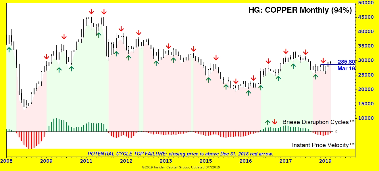
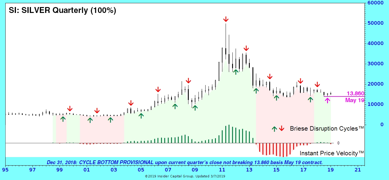
Market Revolutions uses multiple time cycles, which are harmonic in three senses: (1) Edward Dewey, a pioneer in time cycle analysis, found that many cycles are related to each other by simple ratios of 50% and 33.3%. (2) The cycles used are present in multiple time frames (daily, weekly, monthly, and quarterly). (3) The same cycles are present in multiple asset classes (futures, FOREX, stocks, ETFs, as well as stock and sector indexes).
Each price bar represents one period relative to the chart interval (day, week, month, or quarter). IMPORTANT: Price charts are updated daily, so the last weekly, monthly, and quarterly bar will be incomplete until each respective end-of-period. This bar closing date is noted on the respective chart portfolio page heading. Signal failure warnings for all intervals are updated daily, but new cycle turn arrows are not available until weekly, monthly, or quarterly bars, respectively, are complete.
1. HEADING: includes Rank, Symbol, Name, and Signal Reliability∗ Percentage—the percentage of provisional arrows that are validated by the next bar and NOT repainted, that is: erased and redrawn. Repainting is common practice in the cycle prediction business, but in the cycle detector business, we handle them a little differently than most analysts [see #5 below].
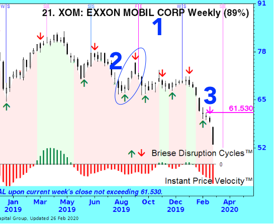
2. ARROW COLORS: RED ARROWS are bearish; they indicate cycle crests. GREEN ARROWS are bullish, indicating cycle troughs. New cycle turn arrows (see #4) are provisional until validated by the next bar. The validation success rate varies by market class, averaging 88% across all bar intervals, based on 20+ years of historical data, but validation (see #5) does not mean that prices will not eventually move through a signal bar. In a major uptrend, it is normal for green arrows (#3) to have more impact than red arrows, and during a major downtrend, red arrows are typically more impactful than green arrows. This characteristic , commonly referred to as translation, can be useful in confirming major trend changes, as can the status of longer-term cycles shown by the IPV™ oscillator (see #7). Cycles are actionable on the open of the next bar (within the limit of validation odds). A turn arrow is (in)validated only at the close of the immediately following bar.
3. MAGENTA ARROW: indicates a new PROVISIONAL cycle turn. But how do you know which cycle is turning? The short answer is it does not matter. Although longer-term cycles can be more powerful in terms of amplitude (price impact), the numerous cycles and phases impacting prices at any given time make amplitude impossible to forecast. Extensive testing of the cycles used in Market Revolutions proved that whether one or more is turning and whether they are in sync has no measurable overall impact on profit potential.
4. CYCLE REPAINTING: It is common practice in the cycle field to erase invalidated
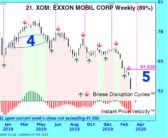 (broken) cycle turn arrows and "repaint" them at a more auspicious time. Unlike others, we allow only one bar for validation, and we do not hide broken arrows. We leave a permanent "x" on the chart for the approximately 1 in 10 arrows that are invalidated by the following bar. Our purpose is to inform and improve your market timing, not burnish our track record by permanently erasing repainted arrows. The red and green "x" (marked #4 on the chart) indicate a higher 2-bar closing price invalidated a cycle top and a lower 2-bar closing price invalidated a cycle bottom. The percentage shown in parenthesis in the chart heading reflects the cycle turn validation rate. For example, (90%) means that only 1 in 10 posted turn signals have been repainted over the entire data series, back 20+ years. Given this high reliability∗, an "x" should not be ignored. Repainted arrows—though technically different than Failed Arrows (see #6, next)—can be counter-indicators, signaling an acceleration in the direction of the current trend.
5. The MAGENTA PRICE & LINE placed next to a magenta (provisional) arrow is the invalidation trigger price, a level that often serves as future support and resistance, impacting prices well beyond their initial timing value. For an up arrow, this represents the 2-bar low; for a down arrow, the 2-bar high. If an "x" appears when the next bar is posted, it means that this price bar closed beyond the magenta line. If the arrow is validated, this line and price level will change to blue. If a daily close is beyond a valid magenta or blue line chart ahead of the next cycle turn, it will be noted by a yellow chart frame as a "POTENTIAL SIGNAL FAILURE". If a closing price is beyond a magenta or blue line by more than 5%, the chart border reverts to the prior turn arrow color (red or green) and is marked as "SIGNAL FAILURE".
These notices may be temporary on still-open weekly, monthly, and quarterly bars, and the chart frame color will return to the most recent arrow color if prices re-cross the validation line before the bar is complete. You need to await completion of the bar to confirm signal (in)validation. FOR FUTURES CONTRACTS: Prices shown are basis the current active contract, noted beneath by month and year. We use CSI Data nearest-contract data, rolled to the highest open interest within the front four contract months. FOR FOREX: Trading is inter-bank; thus, there is no central exchange price quote available, and your broker's open-high-low-close prices may vary. Our source is www.csidata.com.
6. INSTANT PRICE VELOCITY™ (IPV™) on the chart bottom panel is a proprietary measure of market momentum derived from
 kinematic calculus used in mechanical engineering to, for instance, calculate the speed of fluids moving through a pipe. This identifies the major trend (composed of multiple time cycles). Green lines (|) indicate positive momentum, and Red lines (|) indicate negative momentum. The height of the line corresponds to the speed (strength) of the major trend. Declining green lines (|) reflect decreasing—but still-positive momentum, while rising red lines (|) show abating negative momentum. IPV colors are reflected onto the price chart background for easy reference to the long-term trend (cycle). It is wise to appraise the actual IPV bars, which may be moving off a historic extreme or approaching a major trend change (zero-crossing), which could affect the impact of short-term cycles shown by the turn arrows.
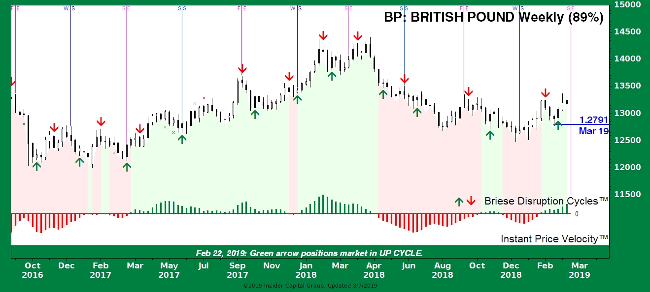
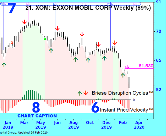
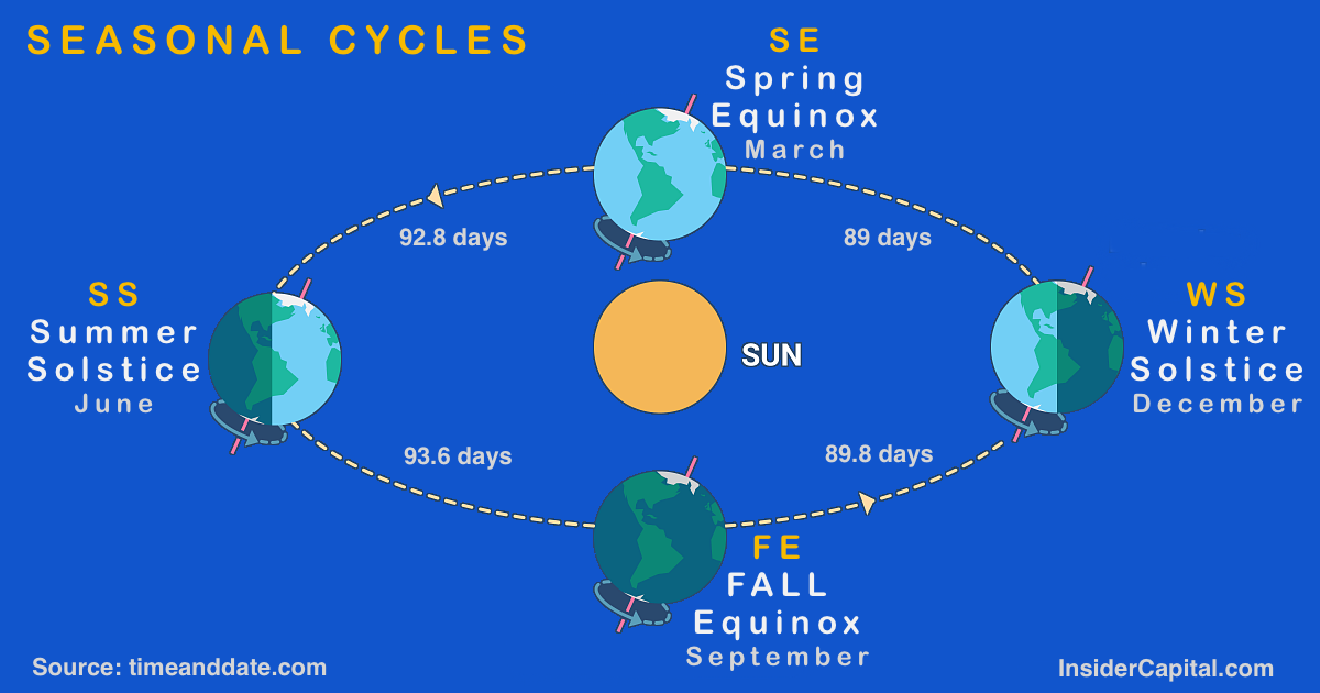
7. SEASONAL CYCLES: There is one other type of cycle we display on daily and weekly charts—solar seasonal cycles. These have been followed for eons and were a favorite tool of W.D. Gann. On daily and weekly charts, each vertical line is marked at the chart top according to the season. In this case, "WS" marks December's Winter Solstice. "SS" will mark the June Summer Solstice. Spring and Fall seasons are based on equinoxes. March's cycle is marked "SE" for Spring Equinox, while September is denoted by "FE" for Fall Equinox. These seasonal turns typically occur between the 20th and 23rd of the respective month. For skeptics, I invite you to read the Insider Money Interim Report published September 24, 2018, when the Fall Equinox led to a 3-month stock market crash that, coincidentally, bottomed on the Winter Solstice. In 2020, the so-called "Shortest Bear Market In History" bottomed in conjunction with the Spring Equinox. As they say, that's not nothing.
8. CAPTION: The most recent cycle event (#2-5 above) is noted in the chart caption (#6), together with the latest outlook revision date.
Ideas On Using Briese Disruption Cycles™ Turn Signals
Your experience with cycles may be similar to mine: I find it impossible to accurately detect or confirm cycle turns in a timely manner. Confirming cycle turns has always been the bain of cycle forecasters. Yet markets obviously do trend in cycles, so it is imperative for a market timer to have the best tools available to detect and confirm cycle turns soon enough to use them to a trade timing advantage. This was the objective in the development of Briese Disruption Cycles™.
I believe our cycle and trend indicators to be a best-of-class combination. I know them to be original and unavailable elsewhere—either individually or as an integrated combination. I hope you find them useful in your trading and investing.
A cycle is a recurring point in time that triggers a given event. In our case, the event would be a trade entry or exit. Traders use all kinds of fundamental, technical, and cyclical methods to identify trade opportunities, but timing is usually the missing element. The Briese Disruption Cycles™ is a tool that can be used to time a market entry on an opportunity discovered with a less-timely methodology. Traders may refer to the market's historical validation record (shown in parenthesis next to the market label) to determine whether to use signals immediately or to wait one bar for signal validation. With an 88% average validation rate, earlier entries can provide a superior entry price level with a known risk. A single periodicity can be used, or with reference to other period charts—the reason we post all longer periodicity charts alongside daily, weekly, and monthly chart pages.
Many books have been written about the use of cycles in trading, so this section is not going to be exhaustive. The critical difference with Briese Disruption Cycles™ is that they are intended to detect current cycle turns, not forecast future turns. One of the shortfalls of traditional cycle forecasting is the inability to account for the natural shift that occurs between long and short cycles during trends. In major uptrends, up cycles are typically longer than (corrective) down cycles, while the opposite is true during major downtrends. In cycle circles (pun intended), these are referred to as "right" and "left" translation. A unique feature of Briese Disruption Cycles™ is the ability to recognize up and down cycles separately, thus solving the translation conundrum while eliminating the dreaded cycle inversion dilemma.
Something to keep in mind when using these signals as a trigger or screen for your trading program: The signals shown are actionable on the open of the bar following the arrow bar (provisional). Our own Bullish Review uses weekly cycle turn signals as a signal trigger, using Commitments of Traders data as the setup. Some example ways to use these cycle signals might include incorporating cycles turns into your current trading program, by:
- 1. Using cycle turns as entry or exit triggers following a trade setup.
- 2. Cycle turns as pyramid points within major trends.
- 3. Cycle turns as profit-taking or partial profit-taking levels within major trends.
- 4. Historical data files, updated for daily download, allow incorporation into your own system development. Portfolios are constructed from the most liquid and actively traded issues. Price data is provided by www.csidata.com.
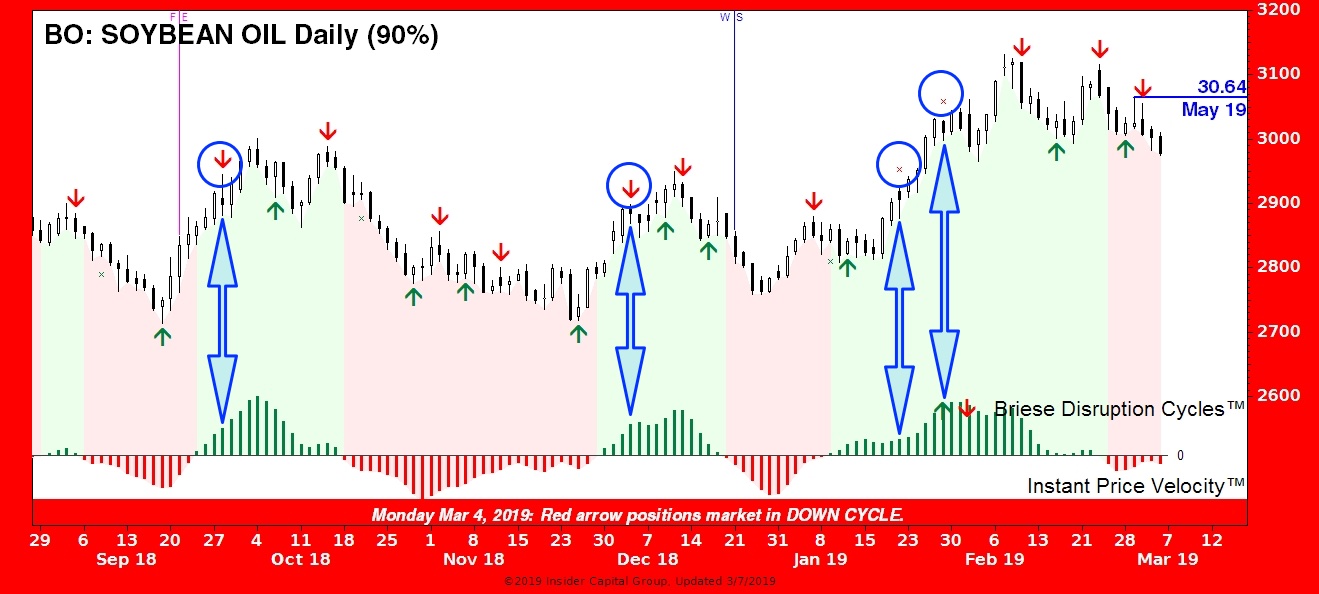 Circled in blue are red cycle down arrows, including "Xs" (indicating invalidated signals) that might fit your premise. The blue arrows highlight the Instant Price Velocity (IPV) bars that create the green background. Note in the circled instances that the green bars are still rising and have not reached an extreme, suggesting there is more upside potential. The other (non-circled) red arrows occur when the IPV has turned down, indicating falling price momentum. You can judge the outcomes for yourself. Keep in mind that these are not "buy" or "sell" signals, but cycle turn indicators for a specific time period (daily). You might want to take note of the longer-term cycle charts, and there are likely other fundamental or technical factors outside these signals that you may consider, as well.
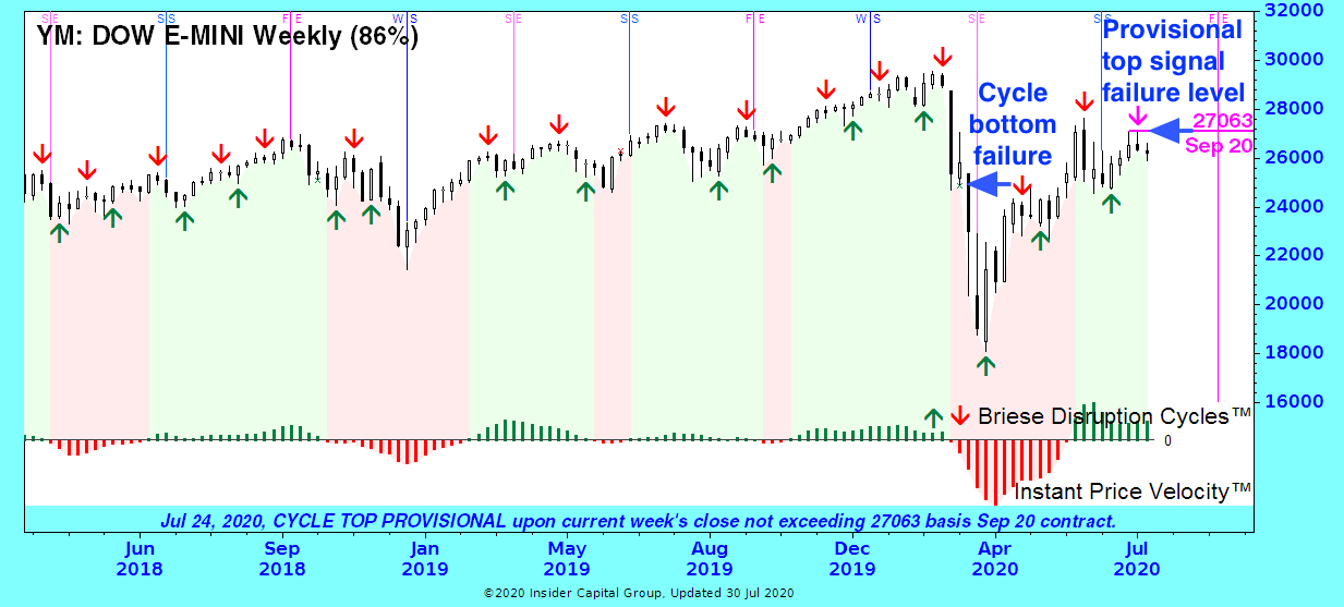 Cycles are validated on the close of the next bar (day, week, month, or quarter). On the sample chart, a green "x" marks an invalidated cycle bottom signal. Cycle bottom invalidations are considered bearish and often indicate an extended downtrend due to a larger cycle's influence. (In this case, the monthly cycle had already turned down.) Although you cannot know until Friday's close that a weekly signal is invalidated, you do know immediately what the invalidation price level trigger will be, as shown for a provisional cycle top at 27063 for the most recent turn signal on this chart. Cycle top invalidations are considered bullish. Because invalidations are rare, affecting about 1 in 10 signals, risk-averse traders who enter a position on a provisional signal may be inclined to place a stop just beyond the signal-invalidation level, while an aggressive trader may be inclined to use a stop-and-reverse order. You always have the option to wait for validation at the next bar's close before taking a position (at the risk of a less favorable entry).
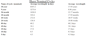 J.M. Hurst was an engineer who, in the 1960s, pioneered market cycle research. His cycles are studied to this day and stand the test of time. Unfortunately, like every other cycle method, Hurst's cycles are only useful for predicting future market turns. All cycle analysis methods begin and end at a cycle trough. What Hurst did not have the facility to find out is that his cycles apply in both up and down cycle phases, just not in the same timeframe. By monitoring cycle peaks and troughs separately, Briese Disruption Cycles™ identified a set of unifying harmonic up and down cycles, in the process, overcoming the bugaboo of all cycle analysts: confirming cycle turns. As it turned out, Briese cycles are a subset of Hurst Cycles, once again affirming his original work.
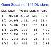 WD Gann's market forecasting methods were purportedly based on geometry, astronomy and astrology, and ancient mathematics, combined into one of the most complex technical analysis methods ever published. He divided cycles into two categories: Natural and Time. Among the most important natural cycles were solar—Winter and Summer Solstice, Spring & Fall Equinox—which are shown on daily and weekly Market Revolutions™ charts. In terms of time cycles, Divisions of the Gann Square of 144 are considered significant (among countless others that make Gann forecasting—lets say—arduous). As we found with Hurst, Briese Disruption Cycles™ include a subset of Gann Square of 144 Division Cycles. A key difference is that Gann cycles are used to predict future market turns, while Briese cycles are designed to detect cycle peaks and troughs in real time.
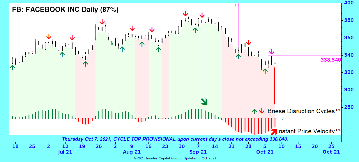 Instant Price Velocity™ (IPV) is a proprietary momentum indicator. The red and green price chart area above the bars reflects the current price trend based on whether the IPV bar is above (green) or below (red) its zero line. Active traders may be interested in entering or exiting a trade ahead of an actual trend change. This is where examining the actual IPV bars can be crucial. There are two examples marked on the FB chart. The first is a red down arrow signaling a cycle downturn with the major trend up (green background). But note that, follow a significant rally, the IPV bars (though still green) have peaked and are now declining, suggesting that the up trend is slowing which may lead to a reversal. This might suggest using the current down arrow to take profits by closing or reversing any open long position even though the trend is still up (green background). In the second example, a provisional down arrow has been triggered, apparently in agreement with the red background denoting a down trend in progress. But the red IPV bars have troughed and are rising. This suggests that the major downtrend (red background) is weakening and may reverse. The play for a swing trader here might have been to take the long trade on the up arrow 3 days earlier (despite the current down trend) and hang on to it now, ignoring the current provisional down arrow (assuming reasonable risk). In any case, active traders will not want to dismiss a long trade just because the major trend is down (red background) or pass on a short trade due to a green background. Closely examine the IPV indicator to appraise the strength of the current trend. While no indicator is perfect, IPV's combination of timeliness, smoothness, and accuracy is unmatched by any momentum indicator I have ever seen.